Gotham
Type History Poster
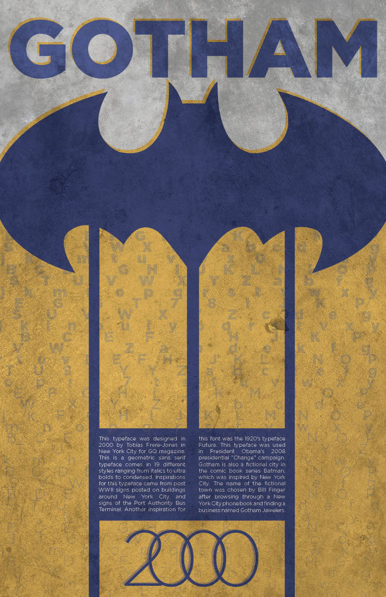
For the type history poster, I chose the font Gotham and took a Batman spin on it, based off the fictional Batman comic city of Gotham. The typeface Gotham was originally designed by Tobias Frere-Jones for GQ Magazine in New York City in 2000. The was designed to be a strong, masculine font, so I chose to design the poster vertically. Vertical lines are symbolic for strength and stability. Since the font was designed in New York City, I decided to incorporate Batman into the poster. Gotham is a fictional city in the Batman comics and the town was inspired by New York City.